10 Tips for Better Financial UX Design
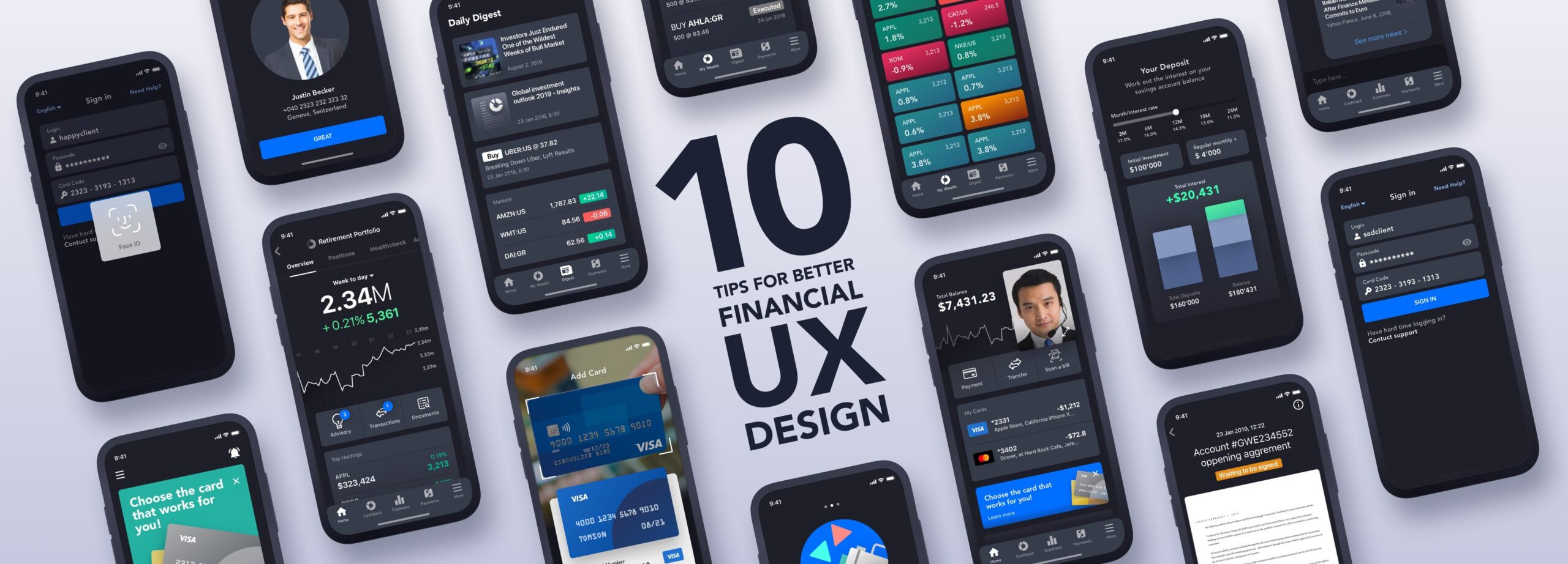
Creating a smooth user experience for banking, wealth management, and other areas of fintech.
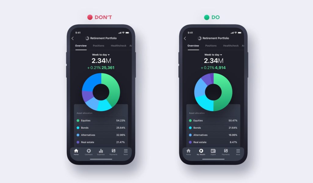
1. 📊 Show, don’t tell
Humans tend to be bad at dealing with numbers. Single calculations like addition, subtraction, and multiplication are simple enough, but add in a few figures and you’ll likely reach for a calculator. It’s especially difficult for humans to compare strings of numbers or complete multi-step calculations. That’s why it’s important to translate that information in a much more digestible form, and data visualization can help. Data visualization is already commonly integrated into reporting and analysis functions, but there are plenty of other potential applications in deposits and loans, investments, and other financial activity workflows.
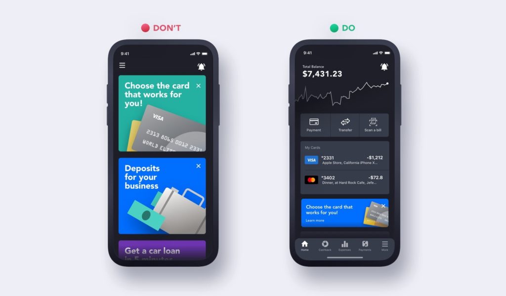
2. 🔨 You’re building a tool, not another marketing channel
Unless the sole purpose of the product is marketing, you will have a series of other user needs to satisfy. While there is value to marketing where it applies, overwhelming customers with irrelevant messages through a financial product can have a negative impact. Users will often simply disable notifications, or they may stop using the product altogether. Although there is a higher level of trust among financial products, many users are still generally skeptical about apps and other emerging technology, and they’re often reluctant to lose visibility over how their information is used.
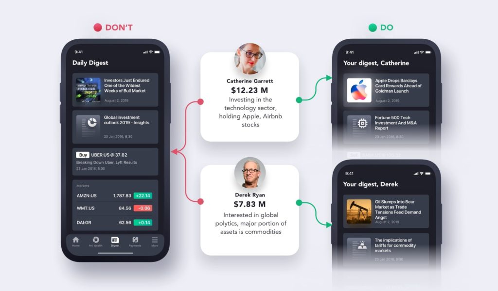
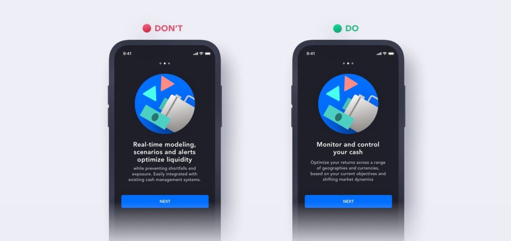
3. 🧵Provide tailored content and personalize
When buying new clothes, one of the first criteria people consider is how well they fit. The same could be said about digital products. In wealth management, for example, there is a ton of performance and market information that can be tailored to a specific high-net worth individual’s assets, investments, and emerging opportunities. There is so much information, people barely have enough time to take it all in. Furthermore, no two clients are the same.
The goal is to create a product that serves as a digital assistant of sorts, to extract the most relevant and important information for an individual user and provide short, digestible summaries. From there, users can choose whether or not to explore further — this is just an entry point through which more engagement is always possible.
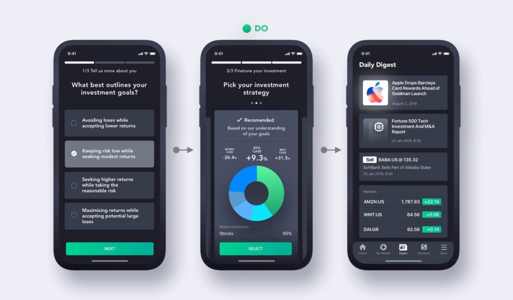
4. 🚪Create a smooth client onboarding experience.
In order to deliver that perfectly tailored experience from day one, it’s important to properly onboard clients. When people hear the term “onboarding”, they usually think about the initial series of forms that describe high-level app functionality and collect basic user information. However, onboarding comprises much more than that: it’s a multi-level process with the simple goal of connecting the user to the product’s value as soon as possible, making sure both the financial institution and the customer have everything they need to operate. Anyone who has ever opened a bank account with a digital bank is likely familiar with this kind of highly streamlined process as such companies put much effort into the design of that crucial first stage. Since financial services usually have high customer values, they benefit from spending higher customer acquisition costs.
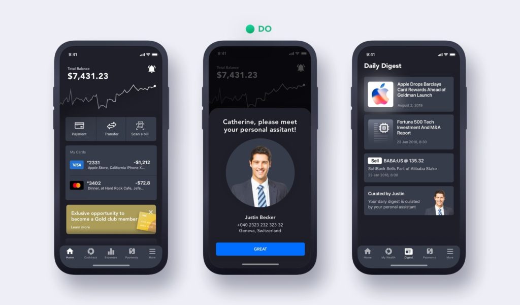
5. 👸 Make customers feel special
Gold, Platinum, and other elite cards don’t have much inherent value other than that they make their beholders feel more prestigious, as if part of a world-class club. In previous decades, this kind of exclusivity was limited to wealth management clientele, but now it’s seeping through to retail banking and other parts of financial service. Don’t get me wrong — I’m not encouraging you to fool your customers, but rather make them feel special. With the technology available today, it’s so much easier and cheaper than ever before to give each client a perfectly personalized experience.
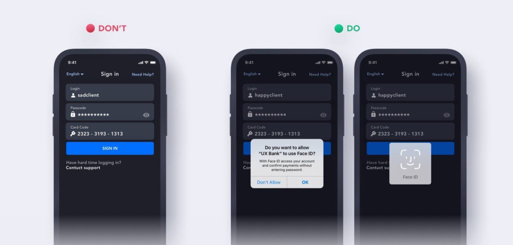
6. 🔏 Don’t leave security to users
With new advanced ways to steal money emerging every day, security is a top priority for consumers and financial institutions alike. In the constant effort to remain secure, it’s not fair to leave the work up to the user. Card code generators, multi-step verification, and other older security methods complicate the day-to-day workflows of modern connected users. These users may feel it’s too complicated to sign in and make use of a digital product, and as a result, they might not do it very often.
Today’s consumers already expect biometric features like fingerprint and face authentication. Offering the latest security streamlines the user experience and also builds user trust. Finding new ways to detect fraud, tracking activity and potential threats in real-time, and making more services available digitally should be the key business focus points over the next decade.
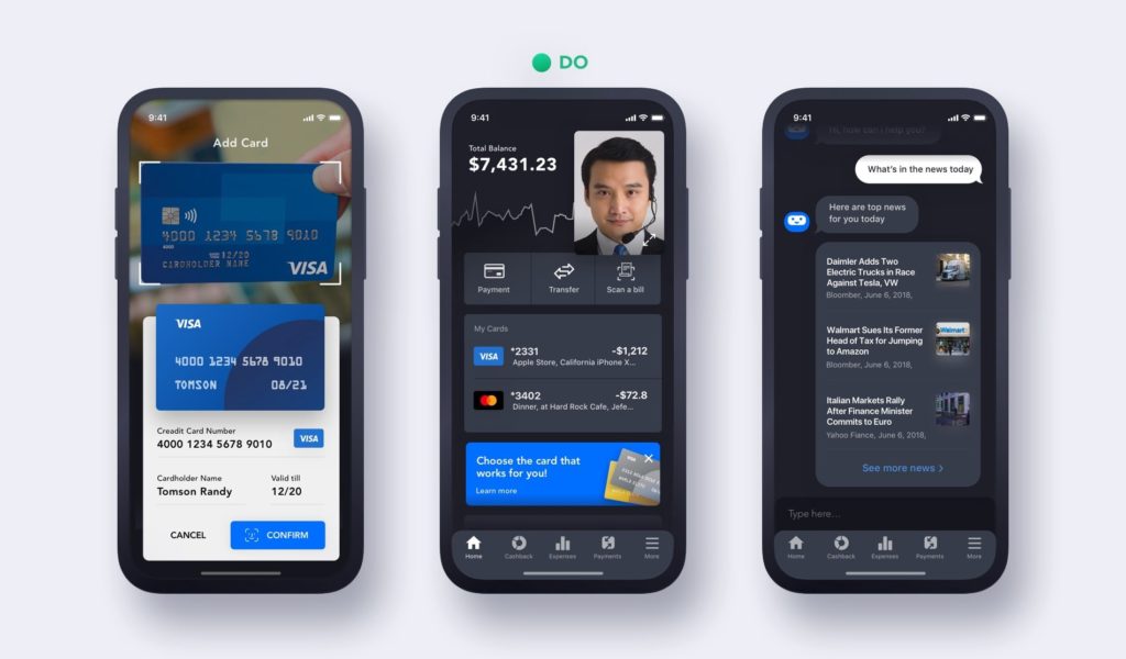
7. 📷 Leverage all capabilities of the device and emerging technology
Financial products tend to be behind the curve when it comes to adopting the latest innovations. There is so much beyond fingerprint authentication — today, cameras can be used to scan payment slips and cards, and data can be extracted from IDs and other documents in mere seconds. Interactions like this save time and help prevent errors.
With the technology available today, businesses can build conversational chatbots into the user experience for seamless support and to carry out simple operations like money transactions. Voice-assisted banking is already popular, and as smart speakers become more popular, we’re rapidly approaching an era where people are using virtual assistants for all kinds of banking transactions. Opening an app and saying “send $100 to my daughter” is no longer a concept; it’s a reality. Even AR and VR offer promising opportunities for banks to engage with customers in new ways.
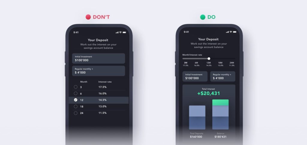
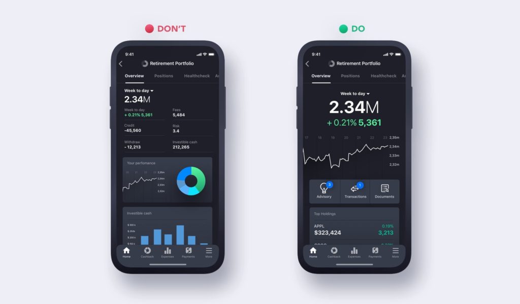
8. 🤯 Don’t overwhelm your users
While we like to think that offering customers more choices and information is useful, it may not be as simple as that. When the amount of information available exceeds human ability to process it, our memory suffers. We forget things and have to put a lot more effort into concentrating on details, and it causes cognitive overload. In terms of UX design, the cognitive load of a user interface refers to the number of mental resources required to operate the system. So how can we reduce it? Here are some tips:
Remove Thoughtfully: Only when you understand the customer journey are you able to properly prioritize flows.
Use Progressive Disclosure: Sequence information and actions across several screens to avoid overwhelming the user and hide irrelevant information by design until it becomes relevant.
Rely on Common Patters: Users prefer to interact with your site the same way they do with other sites they already know.
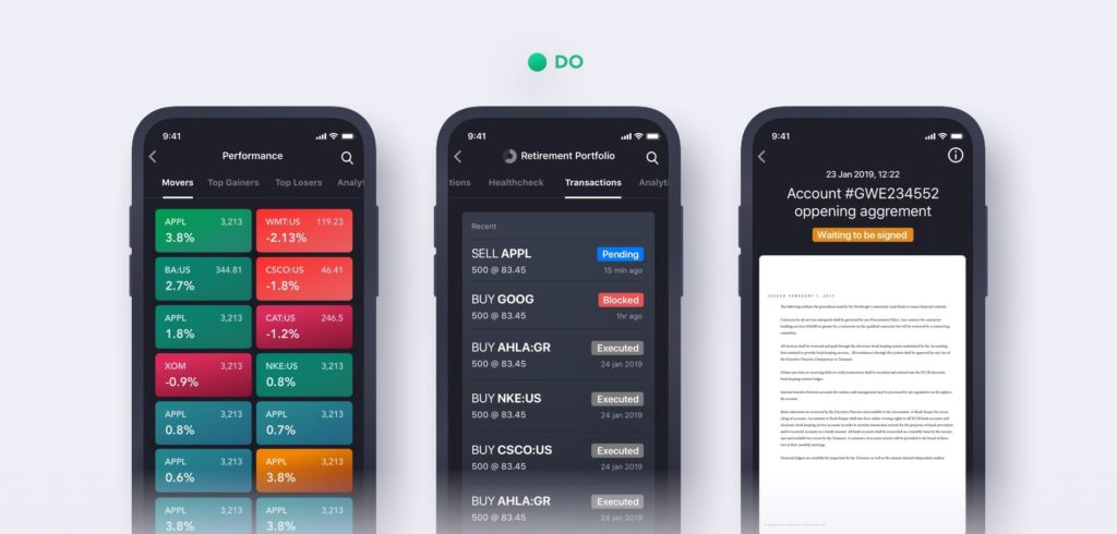
9. 🚦 Be transparent and clearly communicate progress with users.
Uncertainty breeds anxiety, and as such it should be avoided as much as possible. Anxiety increases when dealing with financial transactions, orders, and the like. The first of ten heuristic principles states:
“Visibility of system status is first — the system should always keep users informed about what is going on, through appropriate feedback within a reasonable time.”
Whenever users interact with a system, they need to know whether or not the interaction was successful. Communicating the current status allows users to feel more in control of the system, take the appropriate actions to reach their goals, and ultimately build trust in the brand. Communication increases trust, one of the key elements impacting customer retention. When the system seems to withhold information from users or make decisions unilaterally, users begin to lose trust and no longer feel that the relationship is on an equal footing.
10. 🏛 Speak your customer’s language
Communicating to users is one thing; how you do it is another. Most fintech users can’t make sense of industry-specific terms or the meaning of certain data. If you are looking to design an intuitive product, it’s important to avoid technical language.
Another common issue with the way fintech products communicate with users is the tone and voice. For some reason, it often comes across as too serious, official, or boring. In many ways, this depends on a brand’s overall personality and values. Perhaps people think of banks as serious institutions where everyone wears suits. This may work for private traditional and established institutions, but as times change, even these banks are shifting their messaging as their clients become more diverse. In retail banking, such forced seriousness actually becomes another boundary between your brand and the customer.
PS: 🧮 Make sure the numbers add up on your design)
It seems silly, but you wouldn’t believe how many times some of the first comments we’ve received during design presentations are about mistakes in the data on mockups rather than important areas of the user experience. Much like glaring spelling errors, mistakes in mockup data can quickly divert people’s attention, take away from the presentation at hand, and perhaps even steer it in a completely different direction.
It’s a good idea to make a habit of checking all numbers in mockups and presentations, ensuring that everything adds up and information in all graphics is correct. In order to avoid mistakes, try to work with realistic data samples as much as possible from the onset.